Logo Manual
This manual serves as a guide to maintaining the integrity and consistency of our logo across all applications. Let's explore the elements and usage guidelines to ensure our logo always makes a strong, unified statement.

Variations
Explore our primary and horizontal logo versions.
Primary Logo
Version 01

Horizontal Logo
Version 02
Color Variations
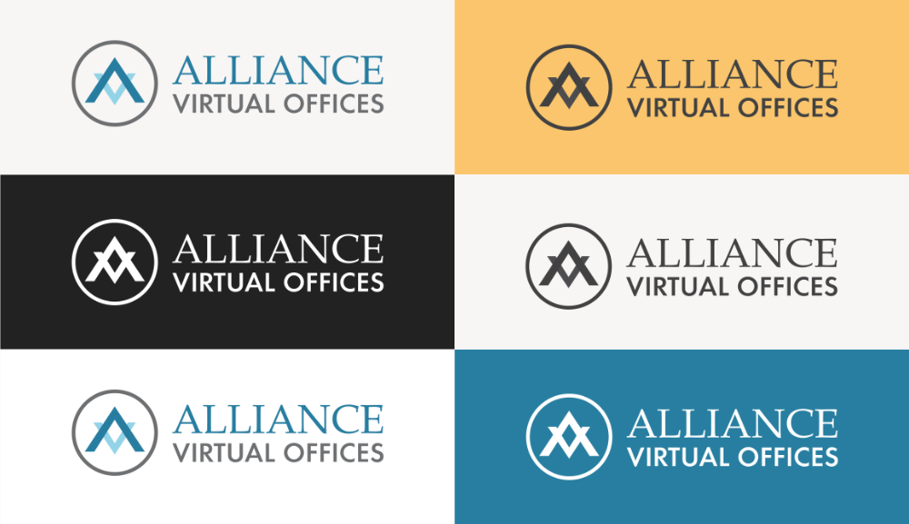
This section outlines how to use each version to ensure consistent and effective brand representation across various backgrounds.

Primary Logo
Original Color

Primary Logo
White Color

Primary Logo
Black Color

Horizontal Logo
Original Color

Horizontal Logo
White Color

Horizontal Logo
Black Color
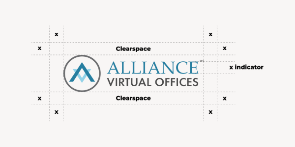
Clear Space
To ensure legibility, always keep a minimum clear space around the logo. This space isolates the mark from any competing graphic elements like other logos or body copy that might conflict with, overcrowd, and lessen the impact of the mark.

Follow Clear Space Rules
Ensure there is appropriate clear space around the logo, at least equal to the height of the "E" in the logo.
Don't Crowd The Logo
Avoid placing the Alliance Virtual Offices logo too close to other logos or elements.
Color Usage
This section outlines how to use colors effectively to maintain consistency and impact. Let's ensure our logo shines in every shade!

Use The Right Color
Please use the original color logo with white or light backgrounds and the white logo with black or strong colors like blue or red.
Color Precautions
The black logo should only be used with light background colors or colors that are too bright for the white logo.
Incorrect Use
Learn what to avoid when using our logo. This section highlights common mistakes to ensure our brand identity remains strong and consistent.
- Don’t rearrange parts or create compositions that are not already provided.
- Don’t change brand colors. Reference the color usage section.
- Don’t rotate the logo.
- Don’t squash or stretch.
- Don’t use logo variations next to the primary logo on the same design.
- Don’t add drop shadows or other text styles.
1.

2.

3.

4.

5.

6.


